Vehicle Planning
A company in the UK vehicle movement industry needed a way to plan their jobs across their national fleet of drivers and teams. They had tried using out-of-the-box systems before but the users doing job planning always ended up using Excel instead because of its flexibility, ease of use, and familiarity, which were lacking in the systems they had tried. However there were significant drawbacks to Excel: poor multi-user support, lack of user action history, typos and human error, and lack of integration with other tools causing data duplication, to name a few.
After internal discussions we decided that our existing product was not flexible enough to provide this, and new custom screens would be needed. I was tasked with designing a solution which was highly functional and decreased planning time.
Broad Themes
I identified a number of themes which would influence the design direction:
Expert users – the solution would be used every day, all day long, by a handful of expert users. This meant leaning more towards functionality, speed-of-use and fast access to system actions.
Support complex, specialised tasks with data-dense display – the user is making complex decisions using multiple pieces of data at once; the job details, the available teams and drivers and the jobs already on each team. The ability to see all of this within a single view is desirable and as screen space is limited, pruning redundant data is a must. Scannability of data is crucial too.
Large volumes of data – it would need to cope well with the volume of data – currently 250 jobs per day and up to 150 drivers, with scope for this to increase in the future. Therefore filtering and chunking data into groups, as well as providing an overall summary will be key to success.
Anatomy of a Job
A job in its simplest form can be defined as “move a car from point A to point B on a particular date”
Each job can be thought of as a unique, self-contained entity, and each job spans at most a single day
A job is allocated by a planner user to a team (which consists of drivers), and the job is then done in the real-world by a member of that team on the next working day.
Each driver will have multiple jobs per day and must travel between the delivery point of one job to the collection point of the next job either by public transport or a lift from another driver.
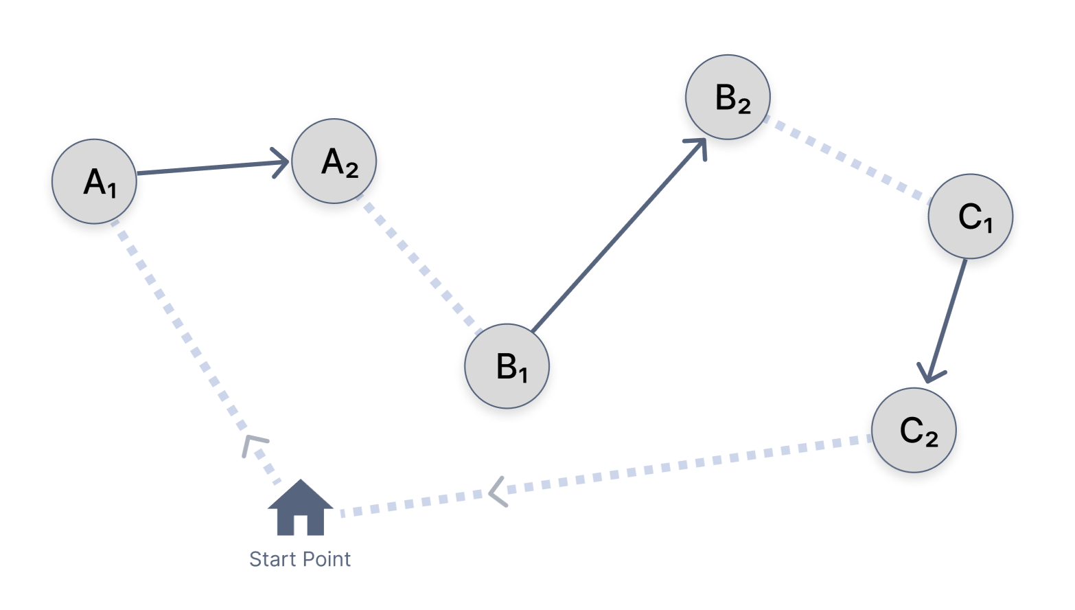
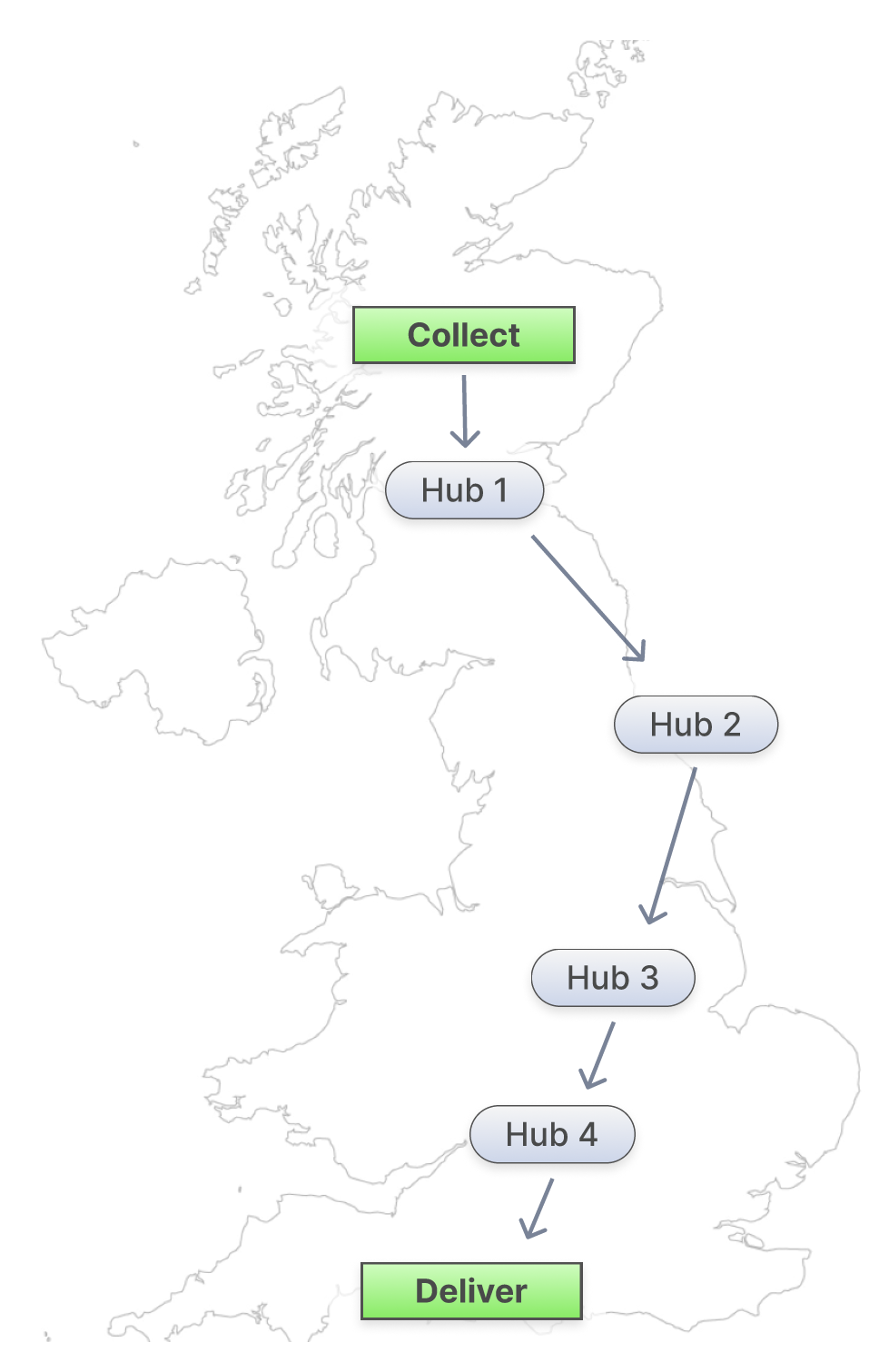
A job can also be split into multiple legs, e.g. collect from A, take to hub 1, then to hub 2, then finally deliver to D. Hubs are storage points dotted around the country.
Legs would never be done on the same day as each other, meaning for planning each leg could be treated identically to any other job.
User Research
To understand what the users truly needed, I undertook substantial research before doing any mockup designing at all. I also needed to verify the validity of the assumptions I had from working with customers in the same industry.
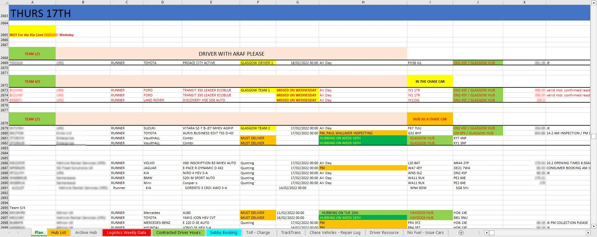
Firstly, I conducted a user interview with the head planner user. My primary goals here were to learn their existing processes for planning, why they were that way, and the mental models they used. This involved a deep dive into the current Excel spreadsheet they used for planning (I’ve never seen so many colours on a spreadsheet) and a mock planning session where I asked the user to explain their thought process out loud at each stage.
The excel sheet they used to use
From this I could identify certain data against each job as redundant as far as planning goes. For example, planners only use the postcode to determine where a job collection or delivery point is, and data such as address line 1, town, and county are not used. This is due to planners spending a large portion of their job talking about and manipulating data with postcodes, and as such they have a detailed mental model of where in the country each postcode is located. There was one exception to this; any locations which were hubs needed to be marked as such, and these were referenced by their hub names, e.g. Bradford Hub, instead of their postcodes.
I also observed the user’s first task of the day, which was manual, was sorting the jobs (based on postcode) into regions of the country. This broke up the planning process into manageable chunks – a classic UX principle! This clearly needed to be preserved in our system, which would have the added improvement of automating the sorting task.
After the interview, my next step was to spend a day at the customer’s premises observing the real planning operation as it happened. Here I saw many of the edge-cases which come up, one being that ‘non-runner’ jobs, i.e. cars which cannot be driven and need a truck to transport them, must be put on the correct team and if this does not happen then a driver might turn up to a non-runner car/job expecting to drive it and not being able to, wasting time and money. Therefore non-runner jobs should be marked very prominently in the UI.
Changing the dates of multiple jobs easily was important too, as typically there would be jobs which did not fit into the plan, and so would need to be moved to planning for the following day.
Once this on-site day had concluded I was confident I had what I needed to produce a mockup design.
Designing the mockup in Figma
Jobs were the fundamental unit and there were 2 buckets of them – jobs assigned to teams (which could be grouped by team) and jobs not yet assigned to teams. But how to organise these?
A job could be displayed as a card, or a visual icon on a map, or a table row. Following the broad themes outlined earlier, I opted for the table row to allow high density of data and scannability. This would mean splitting the screen into a left half and a right half rather than a top half and bottom half so as to not waste space – a job row didn’t need the whole width of the screen.
The basic layout
Because all jobs start off as unassigned and eventually end up as assigned to teams there is a progression of jobs from one bucket to the other. We tend to see progression as going from left to right (probably due to how we read in the West) so it would be natural to have the unassigned jobs list on the left half of the screen and the assigned jobs on the right.
For assigned jobs, they’re each grouped by team and should look very similar to the jobs in the unassigned list as these two lists are constantly being compared with each other. Each team also has attributes of its own, and an ordering of the jobs (e.g. do job C first, then job A, then job D).
The team card
Here, there are job rows (3 in this case), each with 4 columns, and some additional info about the team at the top (2 drivers, no in-house Chase car) and team instructions at the bottom. Clicking the tick icon turns the team green, translucent and uneditable, marking it as finished in terms of planning. Clicking the ‘person - 2’ icon gives a modal with the drivers’ names and details on and drivers from the entire pool can be added or removed. When designing this I had the data-density theme clearly in my mind e.g. column headers were not crucial here so were removed to save space.
A ticked team
Now for how to move jobs from unassigned to assigned (left to right) or back again, or even from one team to another. We could have a button on each job row which lets you select a team (and position within that team), but this would unnecessarily clutter the screen. No, this project was screaming out for every salesman’s favourite feature - Drag & Drop. This also tied into the expert users theme, as I could make use of interaction patterns that didn’t require a lot of UI cues.
Again reflective of the high data-density theme, the unassigned jobs list had to have a lot of functionality crammed into a small space:
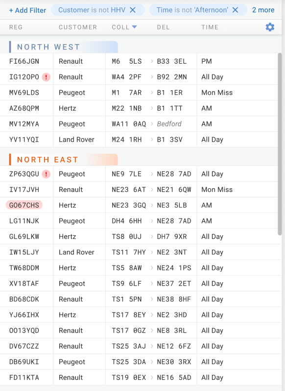
Jobs sorted into regions
Filtering
Configurable column layout
Drag & Drop
Other user actions per job e.g. split job into legs
I managed to prune the number of columns of data down to 7, with 2 of these being true/false values which I changed to icons to preserve space, yielding 5 columns. One of these true/false icons was the non-runner attribute, which earlier I found must be visually prominent – I opted for a red exclamation mark icon. For the filtering, from the user research I determined that more than 2 filters were rarely used so in the rare case that 3 or more were used these could be hidden behind a modal.
A non-runner job from the finished product - the icon was changed to a truck, as this is what is required to move a non-runner car
To aid comparison of postcodes and scannability (in the Collection and Delivery columns) I used a monospaced font. Hubs, for example ‘Bedford’ in the Del column (see below), are visually distinguished too.
User actions other than drag and dropping can be seen by hovering on a job and are displayed on the right as icons. These are inline editing of job details, seeing more details about the job (modal), and viewing/managing job legs (modal).
The jobs list
There was still some functionality remaining that didn’t fit into either the left or right halves, but applied to both halves, suggesting a top summary bar. Namely choosing the planning date, progress/summary data such as jobs planned out of total jobs, and a button to ‘Finalise All Teams’ i.e. mark the day’s plan as finished and allow the drivers/inspectors to see their part of the finished plan before the shift started.
The summary bar, including global actions
The ‘Pen’ icon next to Teams gives a modal allowing the management of teams for that day. This also included an option to Save as Default so the same teams wouldn’t have to be added again every day.
The Edit Job Dates button allows bulk editing of jobs’ dates all to a particular date. Clicking this would add a tickbox next to each job indicating which were to be bulk edited.
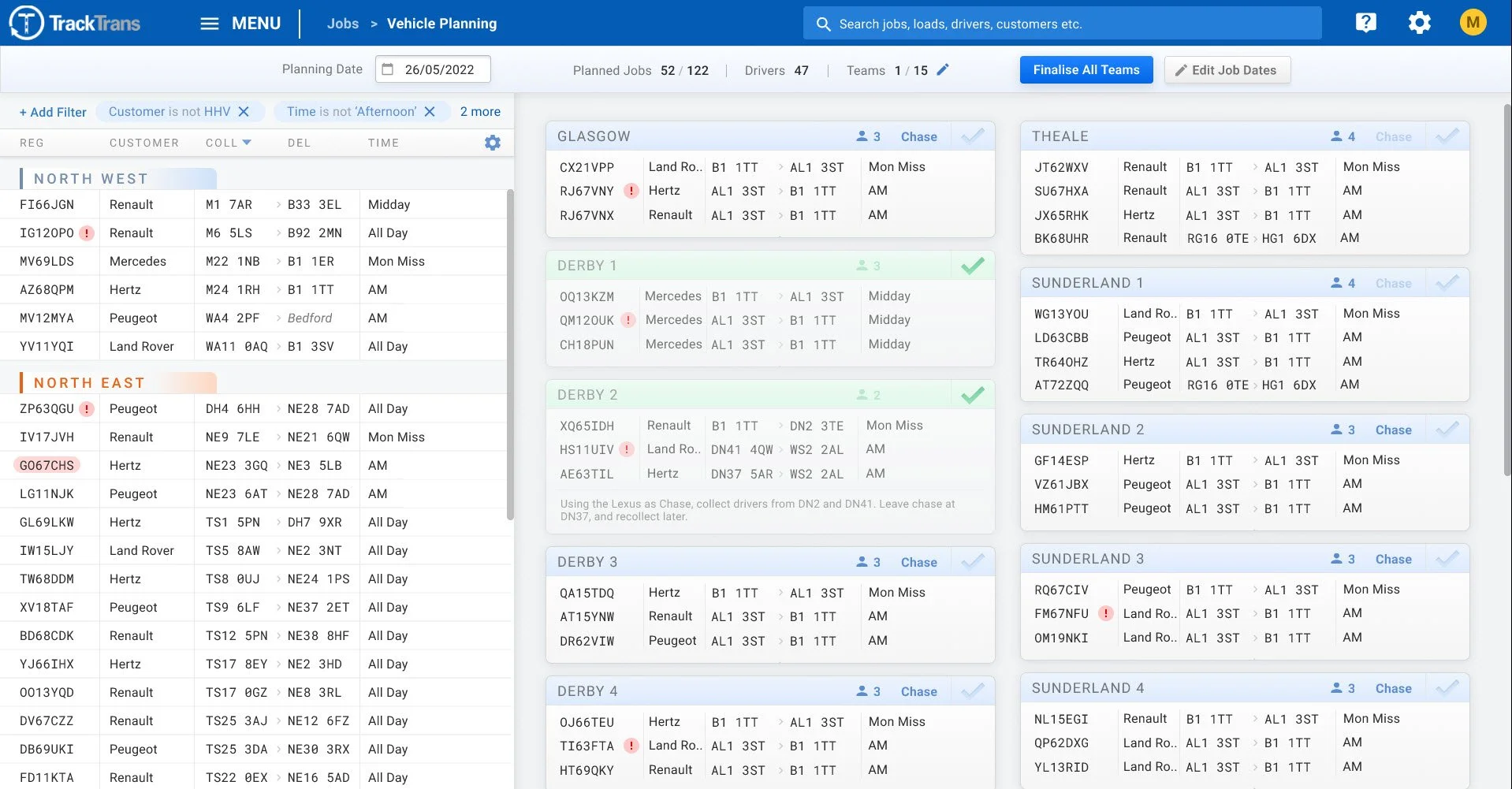
Putting it all together, the mockup looked like this:
The final mockup
Results
Won a new customer which increased our total revenue by 6%. Before this project they were very close to abandoning us as a supplier after the first failed implementation of the legacy system.
High customer satisfaction with the end result, which cut planning times considerably and gave a clearer view of the overall plan. The implementation was seamless and within the first day the users were using it to plan the live operation with minimal guidance from our implementation team.
There was 1 support ticket raised in the first month after go-live, which compares to the 13 raised in the same time period by a different customer who recently started using our legacy system.
